Product Design
20+ years across national and multinational companies, government, publishers and SME / startups. Experienced as a Senior, Principal or a Lead role. Strategic product design and development. Problem-solving & impact-driven.
20+ years across national and multinational companies, government, publishers and SME / startups. Experienced as a Senior, Principal or a Lead role. Strategic product design and development. Problem-solving & impact-driven.
Selection


& get in Touch
Work & Projects
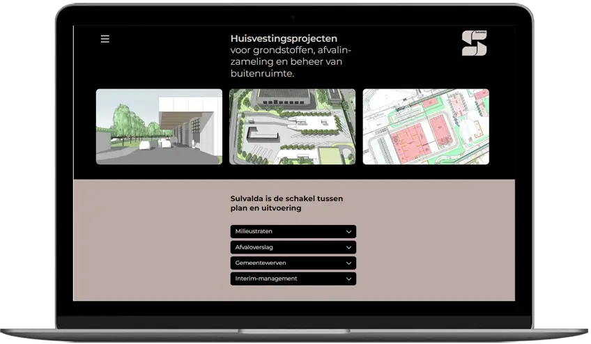
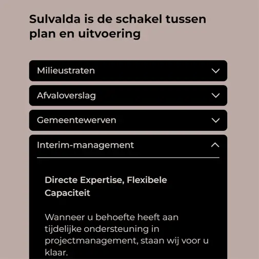
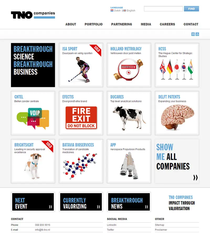
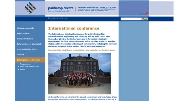
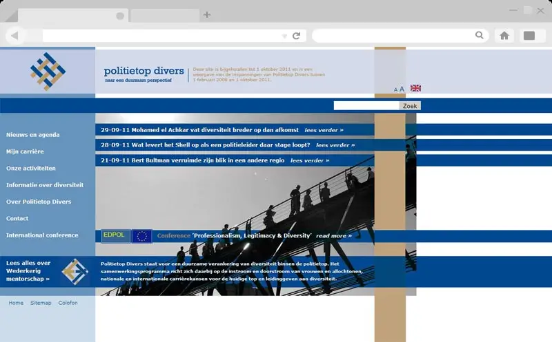
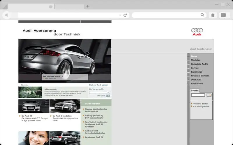
Throughout my career,I have been fortunate to meet and collaborate with remarkable companies and individuals from Europe and around the world.